StowQR on iPad: A Two-Column Inventory Layout
The iPad is built for home organization — enough screen to review an inventory list from across the garage while you're unpacking moving boxes. StowQR finally treats it like the device it is.
A Layout Built for the Large Screen
We've redesigned the Tote Detail view with a native iPad two-column layout — part of the broader StowQR 2.0 redesign. When you open any tote on iPad, the screen splits into two panels that work together:
- Left panel— your tote's cover photo at a comfortable size, plus the tote location and item count at a glance
- Right panel — the full, scrollable items list so you can see everything in the tote without losing the photo context
Set your iPad on the shelf, glance at the photo to confirm you're looking at the right box, and scroll through the contents at the same time. That's the workflow this layout was designed for.
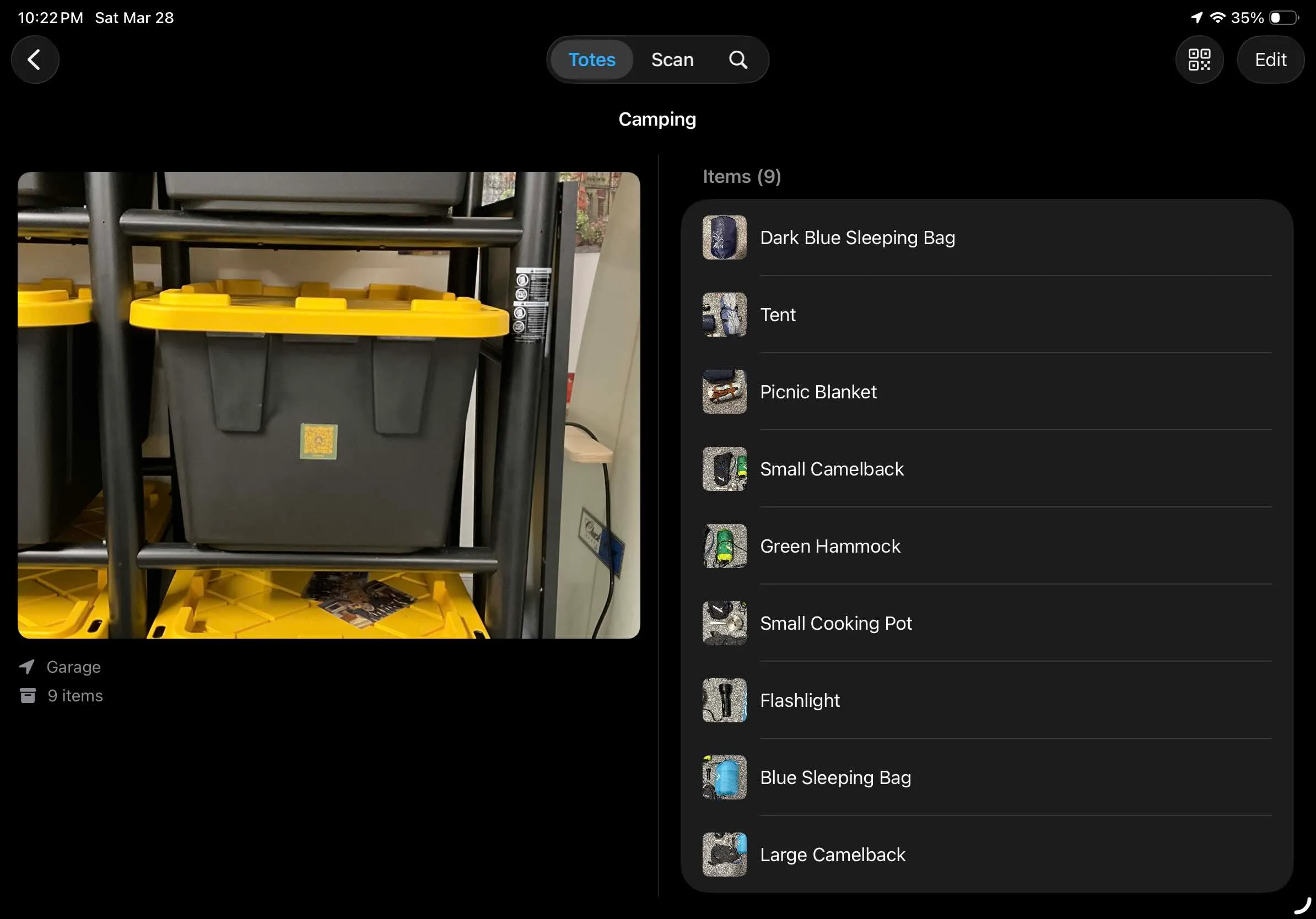
The new two-column layout makes browsing large totes effortless on iPad.
Adaptive by Design
On iPhone — and on iPad when StowQR is sharing the screen with another app — you get the familiar stacked list view. Open StowQR full-screen on iPad and the two-column layout takes over. No setting to toggle, no preference to remember; the app figures out what fits and picks the right layout for you.
Better Photos, Too
Along with the new layout, we updated how tote cover photos are displayed everywhere in the app. Photos now use the same shape as the iPhone camera, which means your tote photos display exactly as you shot them — no awkward cropping or stretching. It's a small change with a big impact on how polished everything feels.
Get the Update
The new iPad layout is available now in the latest version of StowQR. Update from the App Store to get it — and if you haven't tried StowQR on iPad yet, there's no better time to start.